Wells Fargo
Funding
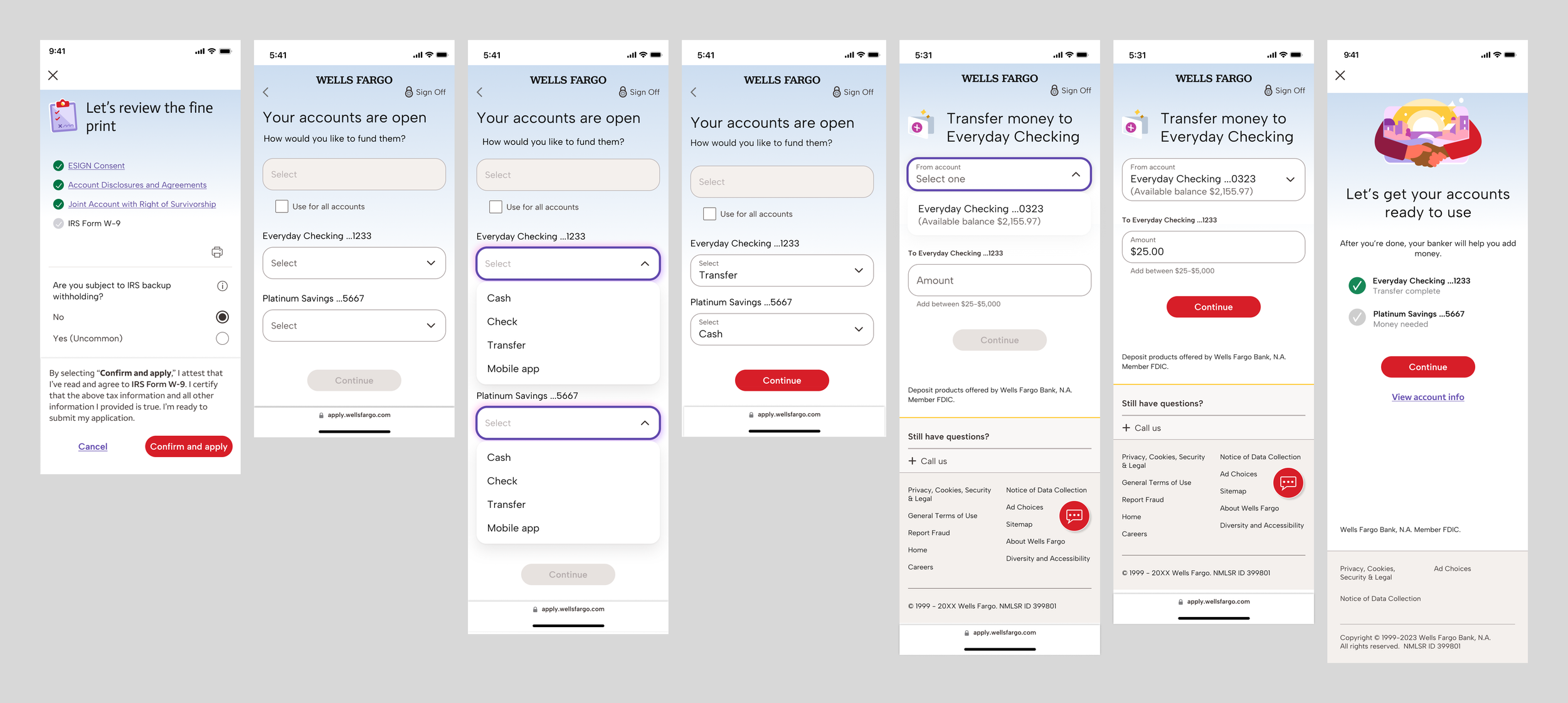
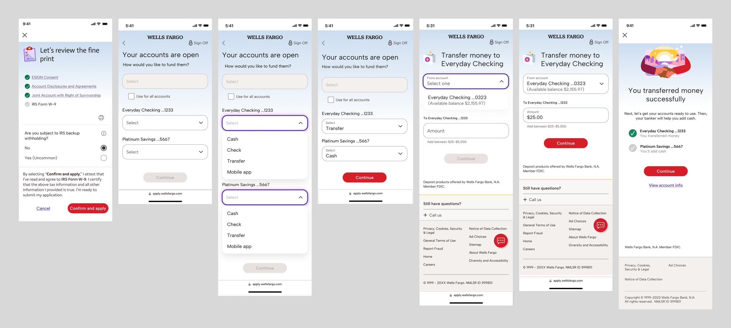
When a user opens a new bank account, they’re taken to the funding flow. We know from research that some people open accounts and forget to add money, so we want to make funding as easy as possible. Funding leads to onboarding, but the transition in the current flow is awkward because the funding choices the user makes aren’t acknowledged. When creating the new flow, my goal was to make sure each step felt like a conversation.
Current flow
The final headline is an abrupt change in subject.
New flow
The new headline acknowledges the choice the user made on the previous screen.
Wells Fargo
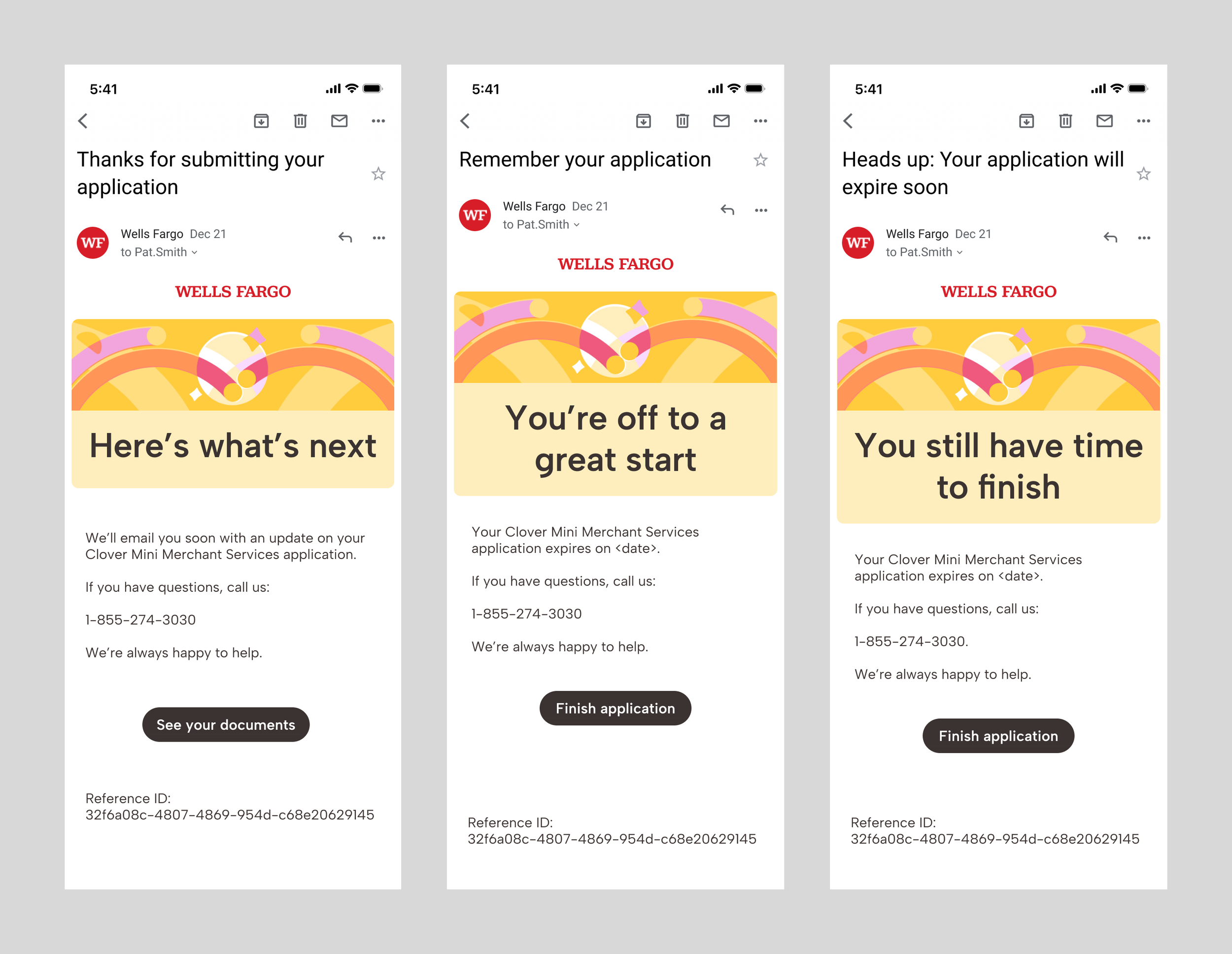
Emails
These emails were my first project at Wells Fargo. My goal was to ensure that the subject and header felt like they were a part of the same conversation and to ensure that the user felt supported during the application process.
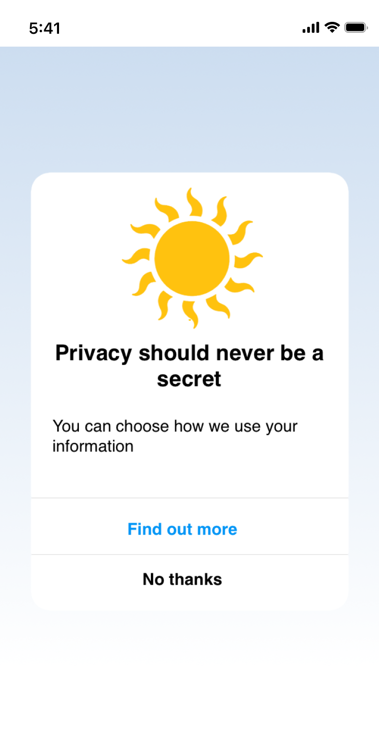
These mocks are representative of a top-of-funnel marketing campaign I led on Instagram. I’m not able to show the actual design or wording. but I’m including the project because I loved the fact that we were able to address data privacy in a new way.
Re-imagining Ads Transparency
Privacy on Instagram, Take 2
Problem
Many people don’t understand how Meta uses their data, and they don’t trust the company to keep it secure. Meta often tries to communicate data practices, but these communications take people out of their desired experience, and they often involved lots of text, which people don’t read.
Solution
Teach people about Meta’s data practices in shorter, more targeted experiences that use transparency to build trust.
Outcome
A top-of-funnel marketing campaign that integrated information on data security into the overarching Instagram experience.
Letting People into the Process
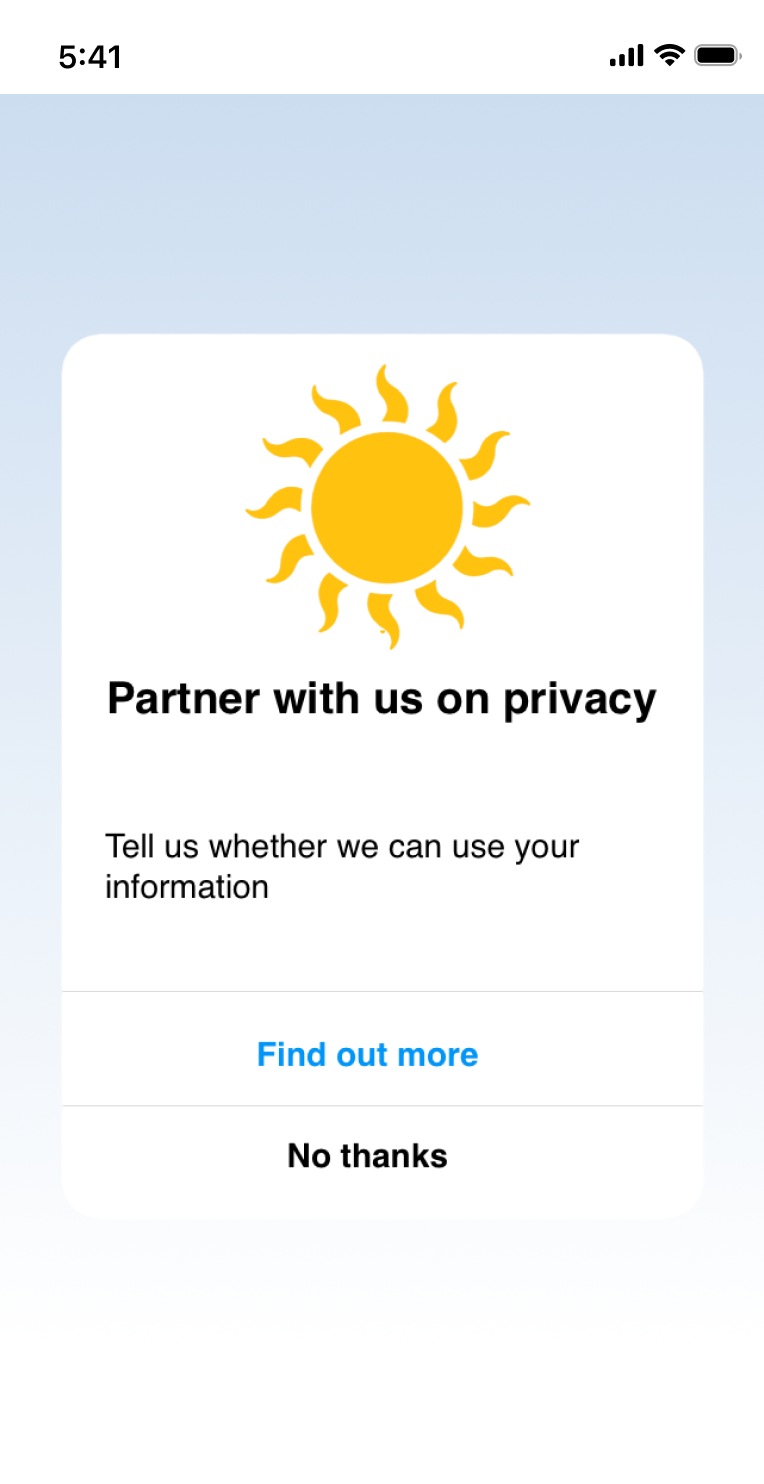
This prompt stresses the fact that users deserve to know what data Instagram receives and to choose how it’s used.
It offers users the chance to engage with data privacy, but it doesn’t pull them out of their experience. If they’re not interested, they can keep scrolling.
Creating a New Relationship
Shifting between you” and “we” as subjects gives users an active role in their relationship with Instagram, one that involves both choice and support.
Prompts
Comcast - Change Management
Saving Billions by Preventing Outages
Redesigning Change Management at Comcast
Problem
The Change Management process at Comcast was so confusing that, when an outage occurred, it was difficult to identify which change in code had caused it. The longer it took to roll back the code, the more money the company lost.
Solution
A complete redesign of the Change Management process on an enterprise application software platform used across the enterprise and based in ServiceNow.
Outcome
40% more changes using automation, which led to fewer mistakes, quicker code roll-backs, shorter outages and money saved.
Process
Original Homepage
A Lack of Engagement
This homepage didn’t engage users by providing them with a clear path into Change Management, so many submitted Change tickets manually, increasing human error.
Others created personal dashboards to simplify submitting tickets. The large number of personalized dashboards greatly impacted load time across the platform.
My goal was to create a page that enabled all users, regardless of experience, to simply and easily navigate a complex, automated Change Management system from one place, decreasing load time, reducing human error and saving revenue.
A Specific, Centralized Approach
After redesigning the content on the homepage, I created a centralized hub for Change Management, which can be reached through the Change Management tile.
Each tile leads to an updated form or process, taking the guesswork out of creating and maintaining changes.
Outcome: An intuitive approach to automated ticketing that saves revenue by increasing the number of Change tickets filed using automation, reducing human error and enabling code to be rolled back quickly in the case of an outage.
Note: Content in this iteration was written by engineers and product managers
First Re-design
Working Towards the Perspective of the User
While Change Management was the focus of the redesign, the homepage needed to serve many purposes. In this version, I’ve organized tasks by tiles, labeling each with an action verb to invite the user into the tool.
While this page helps users to find their use case and complete their tasks, the links divide tasks into teams, which adds an extra step.
I found from user research that the tasks offered in these tiles weren’t the ones that users needed most on a homepage.
Goal: Create a simplified experience in which users can easily identify their use cases and complete their tasks.
Final Redesign - Homepage
A Consolidated Approach
After conducting user research and performing an extensive information audit, I reorganized the information provided on this page so that it prioritized user needs, while still serving the needs of Product and Engineering.
Change, Incident and Problem Management tiles lead to a hub for each, so that users can easily manage them using automation.
Outcome: A simpler system of navigation that lets users chart a specific path through a complex platform, one that requires no unnecessary steps.
Change Management Hub
Comcast - Component Library
Reducing Time to Deployment by ~1.25 days
Enabling users to operate more efficiently in core business practices
Problem
Reliability Engineering is a large org within Comcast. They had never hired a content designer, and they had no universal content processes. The product teams and engineers wrote user interface messaging themselves, which took up too much of their time. They weren’t familiar with user experience best practices, so they missed some opportunities.
Solution
Instill consistent and efficient content processes by creating a component library that provides downloadable design and messaging blocks that can be combined into innumerable patterns, enabling engineers and product teams to easily create user interfaces, freeing up time for engineers and increasing efficiency for users.
Outcome
A reduction in time to deployment that enabled engineers to complete more updates and features per quarter, creating more efficient tools. Updated messaging across internal tools at Comcast that enabled everyone from customer support representatives to engineers to spend less time on tasks.
Process
Homepage
Clearer Instructions to Invite Users In
After completing the first homepage, we broadened our scope. We wanted the library to be something anyone internal to Comcast could understand and use. I redid the homepage to ensure that people would have a clear understanding of what the library does, even if they didn’t have context.
An Incomplete Invitation to Internal Users
The component library is a new way to develop user interfaces on internally facing web-based applications at Comcast. The goal was to create a community of contributors, so that the library reflects design elements from across the enterprise.
The library focuses on design elements for internal users, so I created a tone that reflects Comcast’s overarching culture of community, inclusion and informal camaraderie.
Support Page
Solving Issues and Contributing Ideas
The structure of the content on this page reflects the overarching goal of the library, which is to save time for engineers and product teams while encouraging creativity and consistency.
Because users are visiting this page for different reasons, I supply the basic information and link out to specifics, so that they don’t have to sift through instructions that aren’t necessary for their use case.
Outcome: A page that offers support, encourages contribution and celebrates the internal user at Comcast.